

A Comparison of Different Chart Types
Either using a simple trendline or applying elaborate trading theories, traders were always fascinated about the future prices. It should come as no surprise!
A simple check into the history of humanity reveals ongoing attempts to “see the future.” After all, seeing the future represents the essence of Forex trading.
Regardless the reason, traders buy or sell a currency pair, expecting something to happen in the future. The time horizon doesn’t matter, except when it doesn’t fit into the overall strategy.
The concept existed for ages. Even in trading, right from the start, “predictions” impressed people.
What were those predictions? Nothing but different ways to interpret market psychology and behavior.
For example, when the ticker tape appeared in the United States, it proved to be a groundbreaking development. Suddenly, traders started to “read the tape”.
What exactly did they do? Nothing much, if you compare with today’s practices: they looked at past prices, to predict future ones.
Traders recorded every tick in a stock move, took notes, and even built charts. The Jesse Livermore (one of the greatest traders that ever lived) story reveals the start of modern charting as we know it today.
Next thing you know, traders started to study historical data on bigger time frames. It was more comfortable for individual stocks, as they didn’t exist for long.
For some commodities, though, like corn, soybean, etc., plenty of historical data existed. Based on the research and findings, the results were extrapolated to that period’s stock market.
Charting fascinated technical minds and continue to do so. Different types of charts exist in today’s Forex trading, and they evolved together with technical analysis.
The Line Chart
A line chart is the simplest chart form. Traders merely look at a line on their screens, but it isn’t just a simple line.
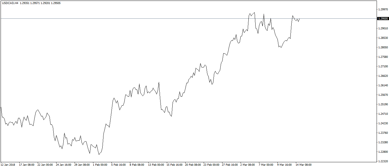
It connects the closing prices of the period it represents. For example, if you apply a line chart to the USDCAD four-hour timeframe, the line joins the closing price of every four hours.
The beauty of a line chart is that it keeps things simple. In a world where Forex trading tends to get overcomplicated, simple things might bring clarity.
We all know Forex trading is volatile. Not only during economic releases, but currency pairs fluctuate a lot.
Because it connects only the closing prices, much of that volatility disappears from the chart. You won’t see the highest and lowest prices in the period, so not all the volatility.
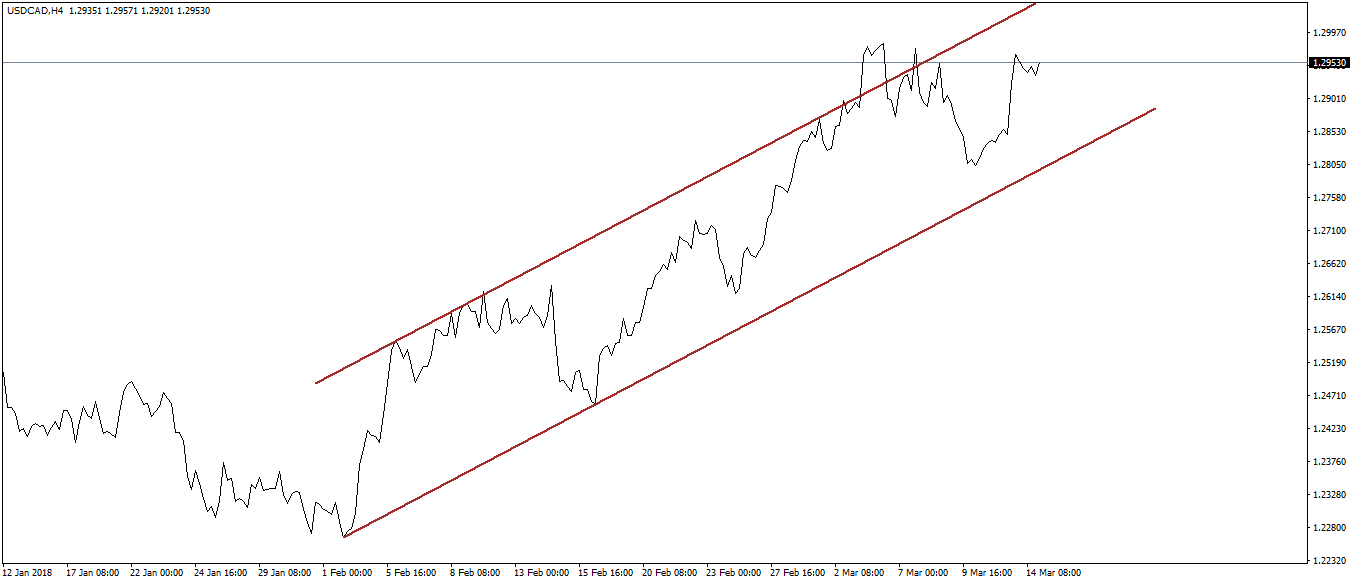
As a result, a simple line is enough for traders to apply technical strategies on it. For example, trend lines and channels, but also classic technical analysis patterns like the head and shoulders, wedges, double and triple tops, and even triangles, work.
The biggest inconvenience, though, is that the highest and lowest points in a period don’t appear. For that, some tools like the Fibonacci ones (often used in Forex trading) simply won’t work.
Moreover, divergences with oscillators won’t work either. How to know if the price made a new high or low unless you see the levels?
The Bar Chart
In sharp contrast with the line chart, a bar chart shows everything: the opening and closing prices, but also the highest and lowest values in a period. Classic technical analysis patterns work better, and even divergences are easy to spot.
A bar chart is the oldest expression of a chart. When the Western world (United States) started to use charts, the bar chart appeared.
Here’s how the same USDCAD chart looks like, only this time on a bar chart.
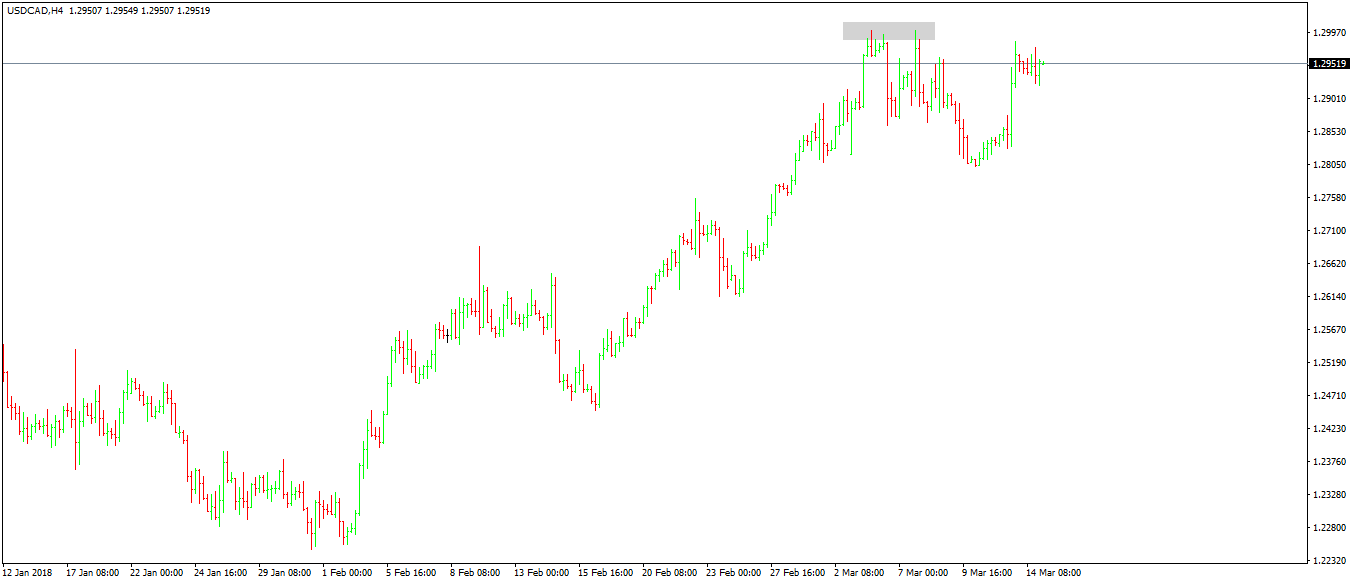
Focus on the grey area around the 1.2960, as highlighted in the chart above. Next, go back on the line chart, and see the difference.
While the line chart shows a lower high, the bar chart shows a double top. From a technical point of view, that’s a big difference, as double tops come with a trading plan, having exact entry and exist levels.
A bar’s opening price is the previous bar’s closing one. Following this principle, a bar chart shows the price action of a currency pair.
While it was the only viable option to charting the stock market, nowadays it isn’t that popular anymore. In fact, in Forex trading, few traders still use it, for the simple reason that Forex trading is relatively new and most of the traders prefer a candlesticks chart.
The Candlesticks Chart
When the Western world met the Japanese approach to charting, it fell for it in an instant. Candlesticks and candlesticks charts became the most popular chart in Forex trading and still is today.
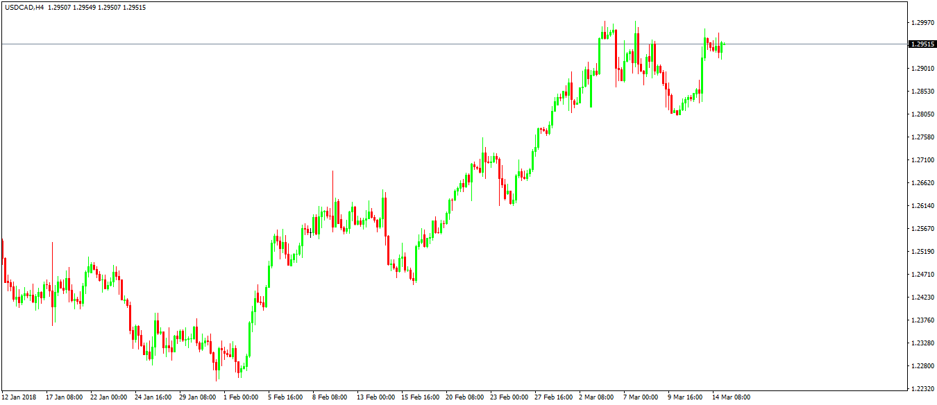
A candlestick shows the opening and closing prices. If the closing price is bigger than the opening one, the candlestick is bullish, or green.
If not, it is red, or bearish. The distance between the opening and closing prices represents the real body, and the lines above or below it are shadows.
As such, a candlestick almost always has both an upper and lower shadow. Believe it or not, shadows play an essential role when trading with the Japanese candlesticks patterns.
Later during this project, we’ll cover the Japanese candlesticks techniques in further details. For now, just remember that the reason why traders prefer this type of chart is because of the patterns, not the candles.
To give you a hint, most of the Japanese patterns take only two or three candles to form. Some, as the hammer, need only one.
In contrast, patterns like the head and shoulder or wedges take much more time. Therefore, it takes a long time until a trade appears, when compared with the Japanese candlesticks patterns.
Other Chart Types
The Point and Figure chart isn’t known in Forex trading because it is an old charting technique. Its idea is to eliminate lull days from the chart so that only volatile ones remain.
Because of that, a point and figure chart looks extremely different from any of the chart types mentioned above. Moreover, traders need to build them manually, as few trading software can plot one accurately.
Building a point and figure chart is not easy. The big problem is to understand the currency pair to trade, in the sense that its volatility plays a vital role.
For example, in a point and figure chart, it all depends on the total distance traveled in a trading day. Because not all pairs experience the same volatility levels (e.g., majors move more than most crosses), the ranges differ from currency pair to currency pair.
Therefore, the first thing to do is the determine what makes a dull day and what makes a moving day. Next, just mark the days that show a breakout. As a result, the chart will look completely different than any other chart type for the simple reason that some days will not appear.
Careful here with trading platforms that show the Sunday candle too! Because Sunday trading takes place only for a few hours, on a point and figure chart the candle won’t appear.
Conclusion
Traders have multiple options to choose from when charting a currency pair. All trading platforms, no matter how famous or not, offer the first three chart types mentioned in this article: the line, bar, and candlesticks chart.
In Forex trading, the candlesticks chart seems to be the first choice among traders. It works with all trading theories and tools, and the patterns offer great risk-reward ratios.
Still, it seems to be just a preference. For example, a trader that uses a point and figure strategy has no option but to use that kind of chart.
Or, one that uses Japanese candlesticks in Forex trading will need a candlesticks chart. And so on.
In the end, it depends on the strategy used. That is the reason why traders choose to use one chart over the other.