What is Swing Charting and How Might It Benefit You?
by Andrew McGuinness Tem 16, 2019
As a trader, you might be trying to find the best way to predict what’s in store for the market. An essential part of Trading 101 includes the need to make predictions about the future all of the time. Making predictions is easy, it’s the successful predictions that are hard to make.
So how do traders go about these predictions? Well, first and foremost, traders need to watch out for trends. The most typical way of finding trends is through swing charting. Here is everything you need to know about swing charting and what it may do for you.
1. Purpose of swing charts
Swing charts are especially convenient and popular when it comes to technical rather than fundamental analysis. This is because they simplify the information provided and focus only on trends rather than mixing in information specific to any particular company.
The main focus of swing charts is the way a stock has been acting on the market over a certain period of time and how these movements begin to form patterns. These patterns may then be used in order to form more accurate assumptions of what could happen to the stocks in the future.
The best part of swing charts is the fact there are no unnecessary frills involved in the process of analysis. What is analysed are trends, and absolutely nothing else. Even though this means the analysis is not going to be personalized or particular to the given company, it is helpful for those who believe a trader should rely on trends only.
There are several different routes you can take in terms of analysing trends. Two particularly popular ways of analysing trends through swing charting are Kagi charts and Gann-based swing charts.
2. What they look like
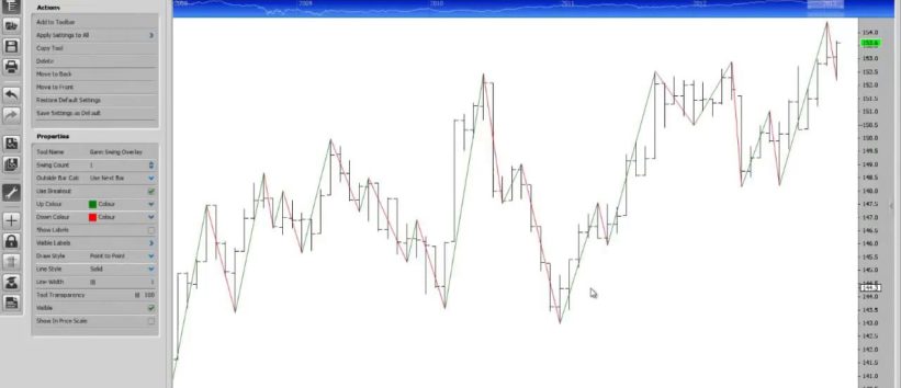
Swing charts basically look like any chart you will have seen, with price bars as its main attraction. Represented on bar charts, these price bars are laid out to vertically illustrate the highest and lowest prices the stock has reached within a short period of time. These price bars have pegs as well. One peg on the left shows the opening price of a stock, while the right peg shows its closing price.
There’s more than one way to illustrate a company’s highest and lowest points with swing charts. The pattern is usually easier to distinguish when color is involved. For example, the Gann swing chart makes use of black, red, green, and blue.
Black is used to represent an inside day, with the lower highs and higher lows. Green represents up days with higher highs and higher lows. Red represents down days with lower highs and lower lows, while blue shows outside days with higher highs and lower lows. These patterns are particularly useful as signals for when to leave or enter the market.
3. Examples of how swing charts are used
In order to find a more general pattern and take a look into market equity, it is advised that you create a trend line. This is done by finding where highs and lows seem to become gradually higher.
Profit and stop-loss points are also easily detectable on swing charts. These can be found by simply finding a point where a high begins to suddenly drop, or when the stock begins steadily stepping up in value. Pulling your investment in order to avoid losses (stop-loss) would be advisable when a high suddenly starts dropping, while a good point to invest for quick profit would be when a stock starts taking steps toward a high.